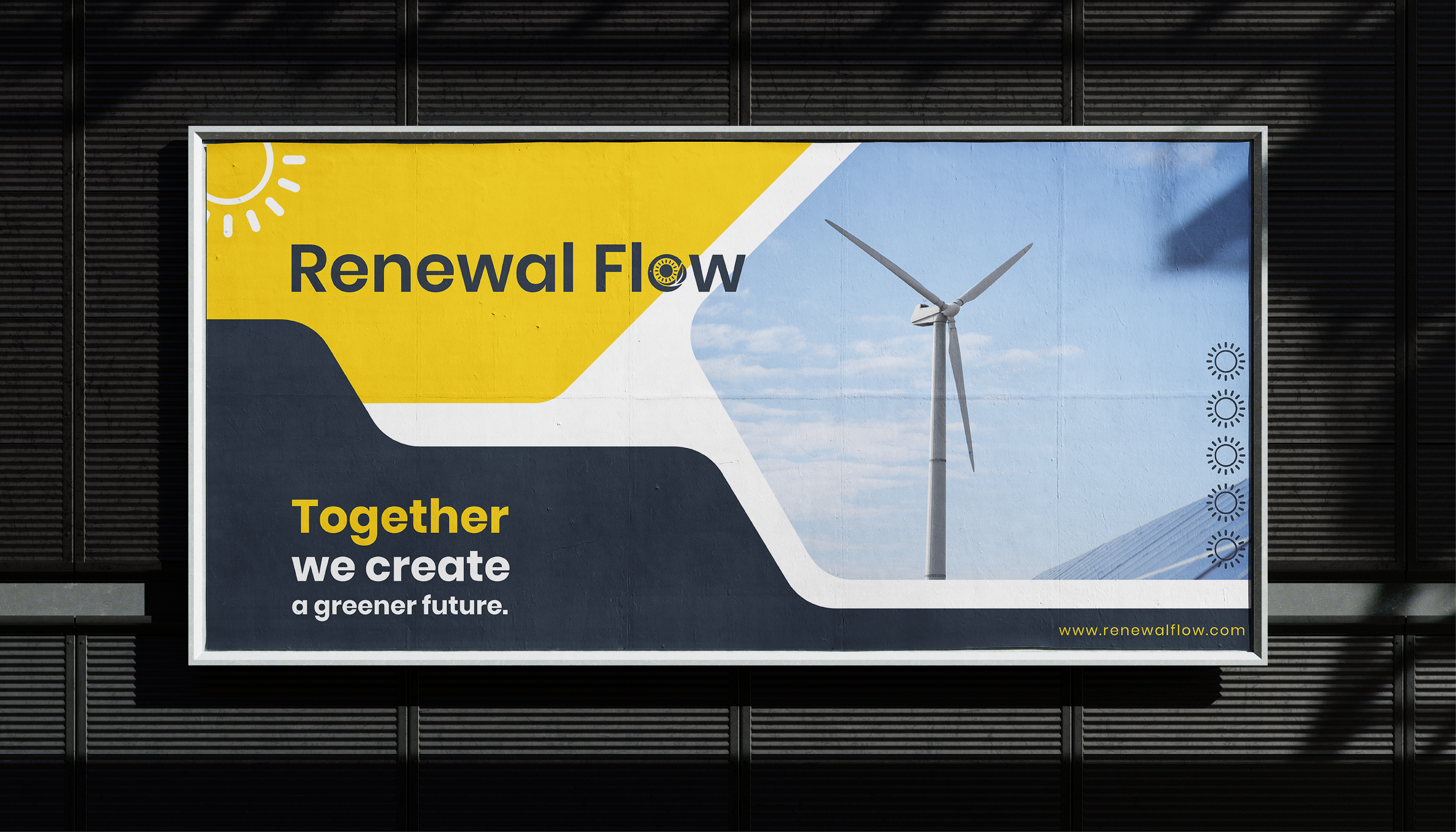
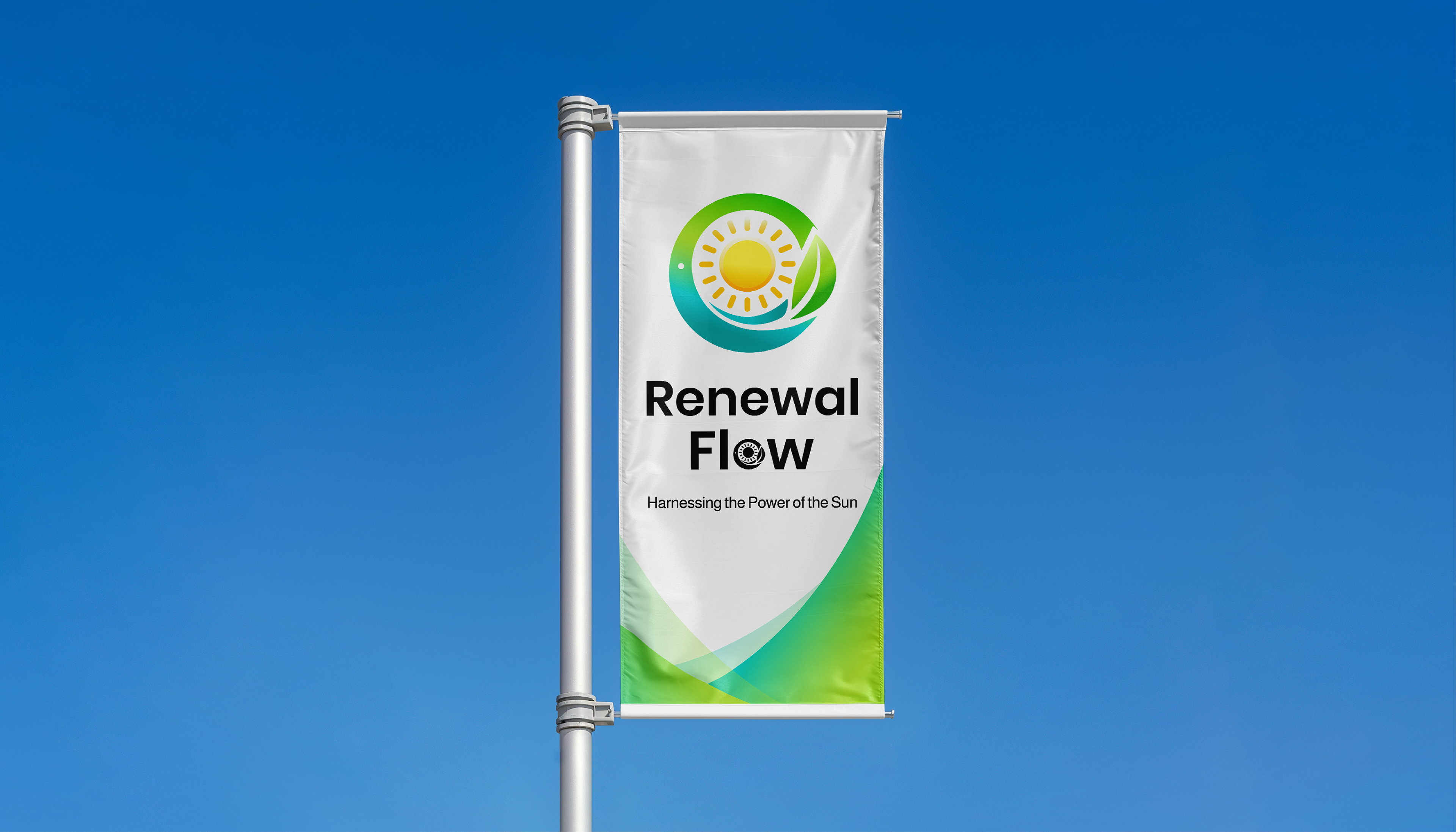
Renewal Flow
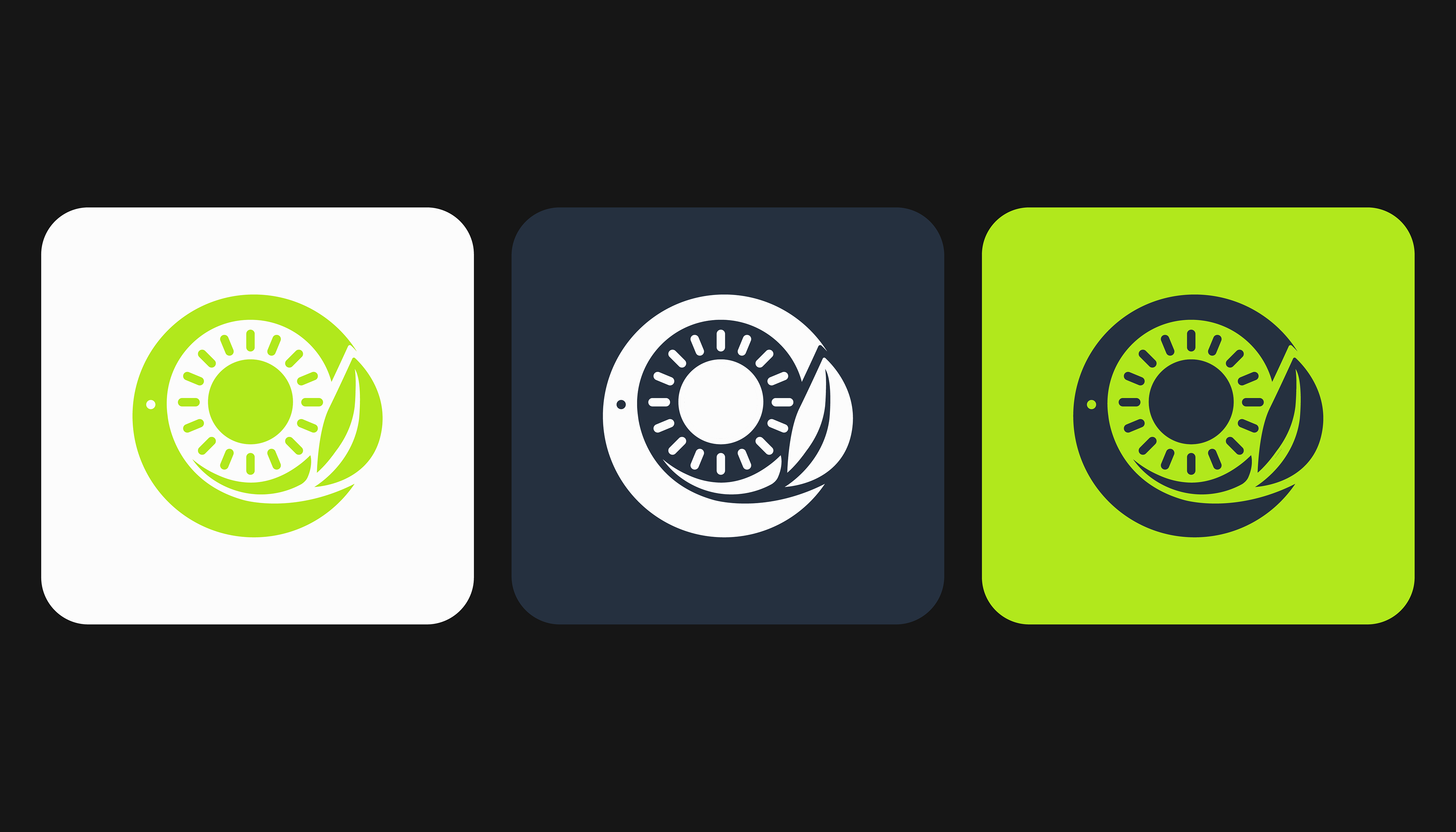
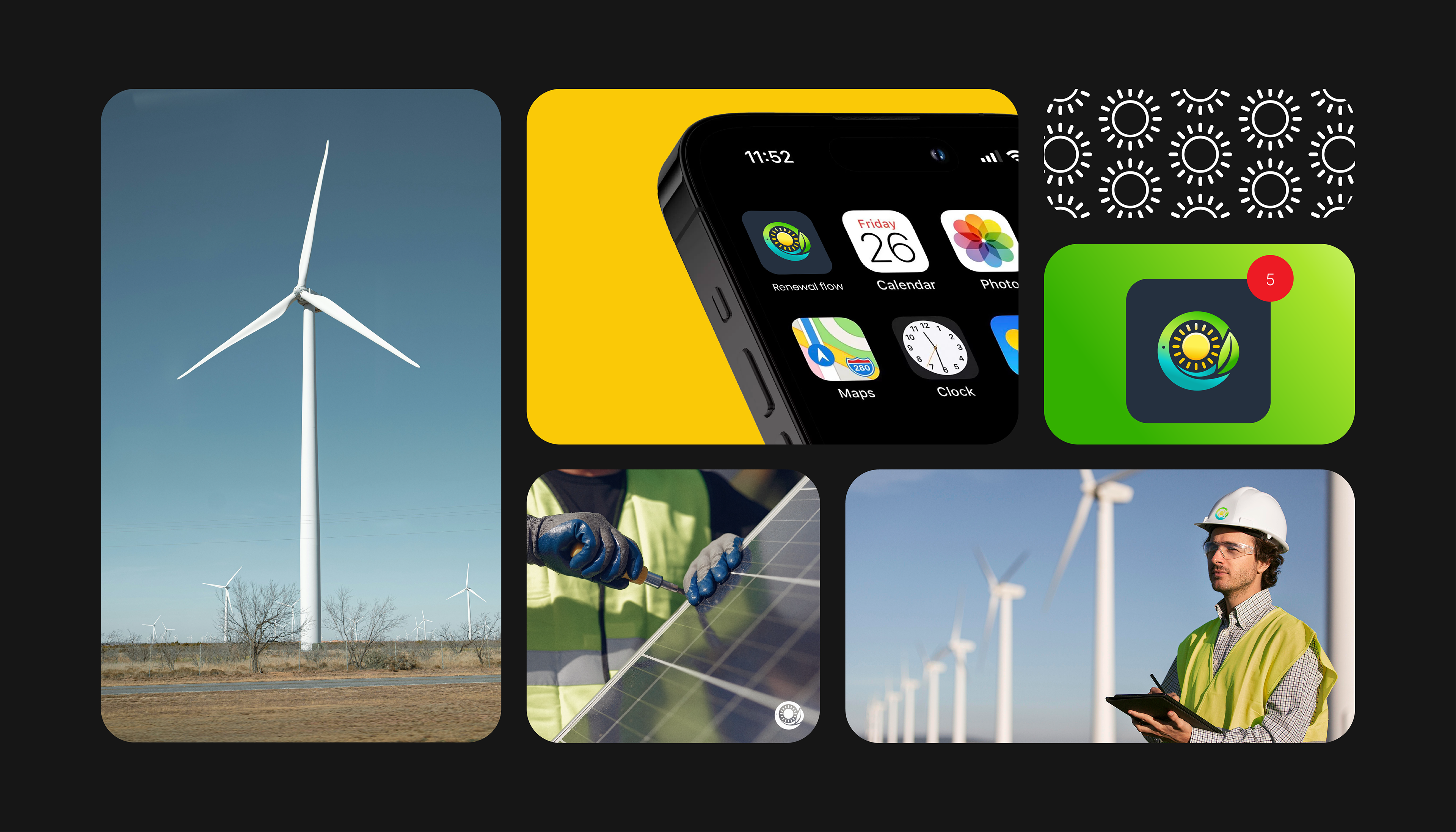
This project showcases the logo design for Renewal Flow, focused on renewable energy solutions. The concept revolves around sustainability, innovation, and eco-friendliness.
The logo features a circular shape symbolizing cycles and continuity, with a bright yellow sun radiating clean, minimalistic rays at its core. Surrounding the lower half of the circle is a green leaf, representing nature and sustainability. The combination of elements conveys the harmony between technology and the environment.
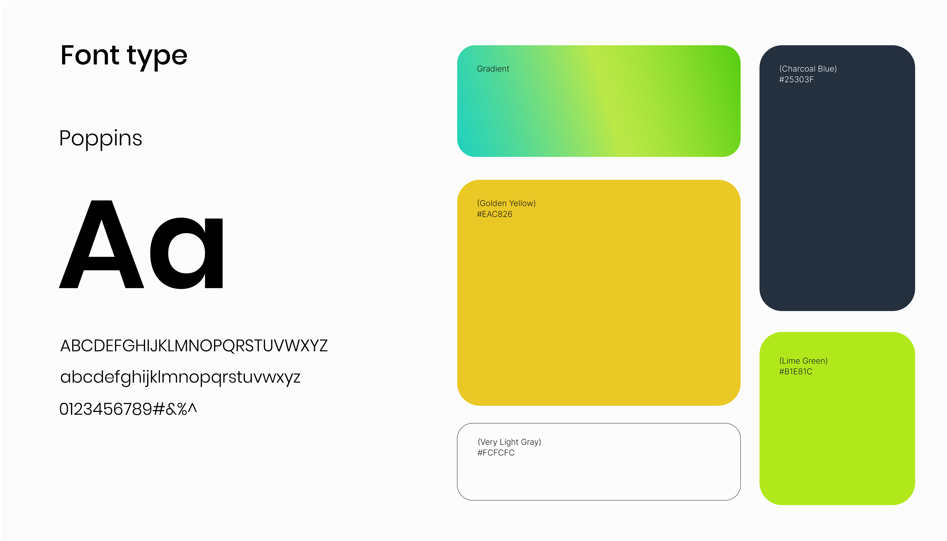
Key Design Details:
Colors:
Yellow | for optimism and energy.
Green | for nature and growth.
Blue | for trust and professionalism.
Typography: The logo uses modern, clean fonts to ensure readability and align with the brand's innovative image.
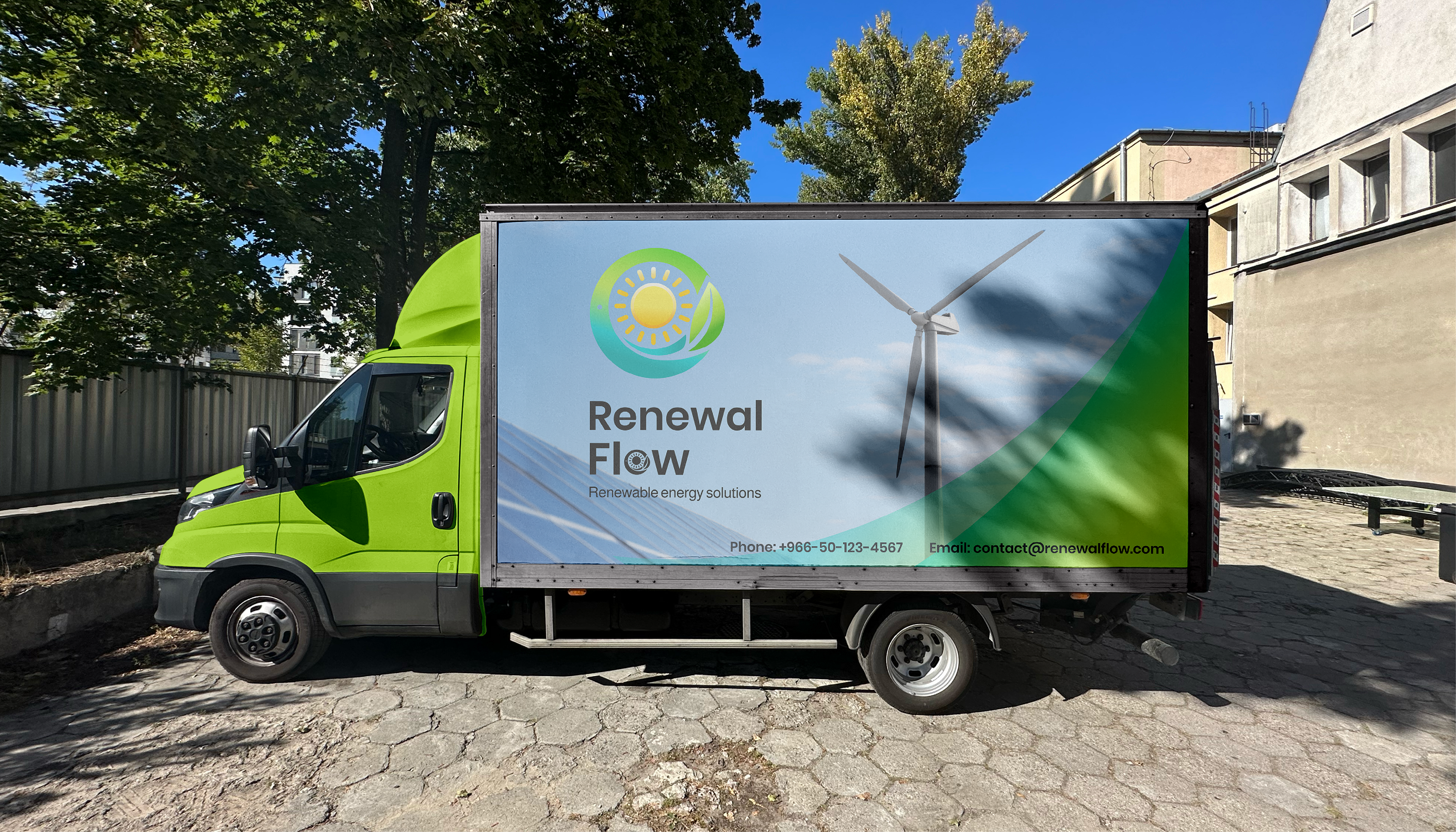
The logo is designed to be functional across various media, from digital platforms to printed materials, ensuring scalability and clarity in all applications.

THANK YOU FOR WATCHING .